Tuesday, 17 November 2009
Thursday, 12 November 2009
CD DIGIPAK DESIGN PLAN
RED AND PINK FONT

For my first two plans i used pink and black font with no background colour. The reasons for not having a background colour was because i thought it may draw more attention to the artist. from the drawing i can see that this digipak design looks to plain as it does not come across as appealing and eye catching to the audience. The name of our album is called Euphoria which means happy, so using a bright colour such as pink emphases this mood of having a happy ora.


Purple background

Blue background.

From desinging different Digi-pak designs we were hoping to discover what Digi-pak attracted the most attention. We used these designs when asking people which Digi-pak they preffered and why they liked it. From asking individuals we found the most common Digi-pak design people like was the blue design simply because it was a brighter colour than the others and resulted in being more eye-catching. Eye-catchy designs are recommended when trying to sell your product to ensure your product draws and attracts attention from the targeted audience.
Wednesday, 4 November 2009
CD Album Research
Digipak Research and Planing.
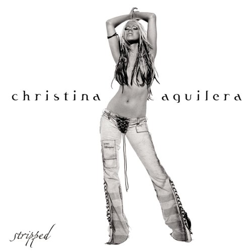
Image analysis:
Artist: The genre of this type of music would be RnB therefore the pose of this artist displayed in this image, portrays a common connotation of this genre. This is seen from the characteristics of this image and the association it has with the RnB genre. For example. Christina Aguilera has a very defined feminine pose and her body being quite revealing, this type of image would sale a RnB album, based on the appreciation and appeal is has with its target audience.
Costume: The album name has been cleverly created to correspond with the costume of the artist. The album name is called "stripped" and the image of Christina Aguilera is "Stripped" of clothing on her upper half, as well as there being stripes on her trousers and her hair being streaked. This makes the album name easily recognisable and the target audience would be more likely to remember this album name based on the artists image.
The artist being positioned in the centre of the album cover creates greater attraction towards the artist, this is also a way of the artist selling the album as the album cover would be more appealing towards the target audience.
Magazine designs for my advert

The title of the album will be at the top of the page so it will be noticeable and the audience will recognise the album name immediately. This is the format we wish to follow as it will capture audience attention. The "Out Now" date will be in bold to aware the customers when the album is on sale; this is an important marketing technique as it will increase chances of sales. The advert will also offer an e-mail address where the audience can find more information on which outlets the album will be sold, this makes the buying of the album more convenient for the audience. The audience will therefore be more willing to go and buy the album from the outlets stated. The image as seen above will be in the middle of the advert to capture audience attention; the artist will be in this image, as the artist’s picture will sell the album.
Down below we have shown different styles and formats of posters, we designed these styles to get feedback from the audience. The feedback will be able to help in making the decision on what style and format we should use for our final music advert. The advert which captures more attention and appeals more to our target audience will be used as it will result in being more successful and will increase chances of high sales.